Another template work in progress. I was thinking that I wanted something a little more understated than the last template, especially since I’ve started putting up music which is pretty lo-fi. Sometimes I loved the banner in the last place and sometimes I thought it was too much.
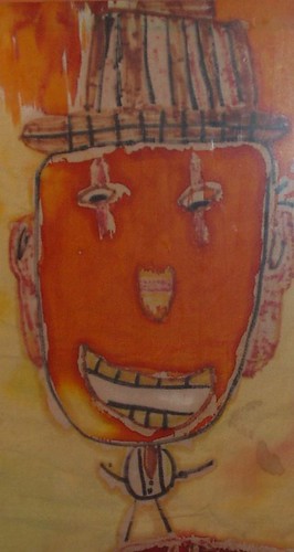
I’m thinking of putting some of my own graphics in the banner, eventually. Such a lovely shade of brown on the right. I thought about putting up this clown that I made when I was 7 or 8 years old. It was made on cloth with hot wax and tie-dye. I had a hippie art teacher. There’s more to it than the clown. A plane’s trying to shoot it down like King Kong, and a little person, probably me, is yelling "Help." It’s called "Curcus Town." I’ll put up the whole thing at some point when I manage to get a decent picture. I always wanted it for an album cover.
Let me know if the site doesn’t work. Or if this is a drastic mistake. I’ll be surprised if everything went smoothly. I’m going to try to make this the last change for a while.


5 comments:
I like the new look.
As for the clown, until I read your entry, I thought it was actual art made by an adult. Whether that says more about your clown or my appreciation of art, I don't know.
Tomorrow, I'm off to the center of true American art for four days: Las Vegas. Carry on without me.
Totally love it. Really looks great, and ditto to the clown comment.
Nice job!
The clown. I vote for the clown. It's brilliant. I wasn't thinking anything about the brown sidebar or the appearance of the page, which means it wasn't emoting to me...doesn't matter...but then there was the clown. Wow. Those eyes!! The colors. It's fantastic. I can't believe you've not done anything with it yet. It's been waiting years. You've got to give this clown its due.
But please don't shrink the clown down. Leave it the size it is. Let it take up the top part of the page if you must. Merits it. I want it framed and on my wall.
But please don't shrink the clown down. Leave it the size it is. Let it take up the top part of the page if you must. Merits it. I want it framed and on my wall.
Post a Comment